Seeing Flavour
Does a Whisky Label’s Colour Shape Taste Expectations?
Written By: Reece Sims
Imagine standing in the chip aisle: no names, no ingredients, just coloured bags. You'd still probably know which one is cheddar, which is jalapeño, and which is salt & vinegar. Why? Because over time, colours have become flavour cues. Now picture yourself in the whisky aisle. Could those label colours be telling your taste buds what to expect too? Turns out, they might be.
Colour as a Sensory Shortcut
From childhood snacks to adult spirits, we subconsciously learn to link certain colours with specific flavours. This happens through repeated exposure, cultural norms, and clever marketing.
And it’s not just marketing fluff—many scientific studies show colour can actively alter our taste perception. We don’t just associate colours with flavour; we taste based on what we see. Our eyes prime the palate. In other words, the label does a lot more than just sit there and look pretty.
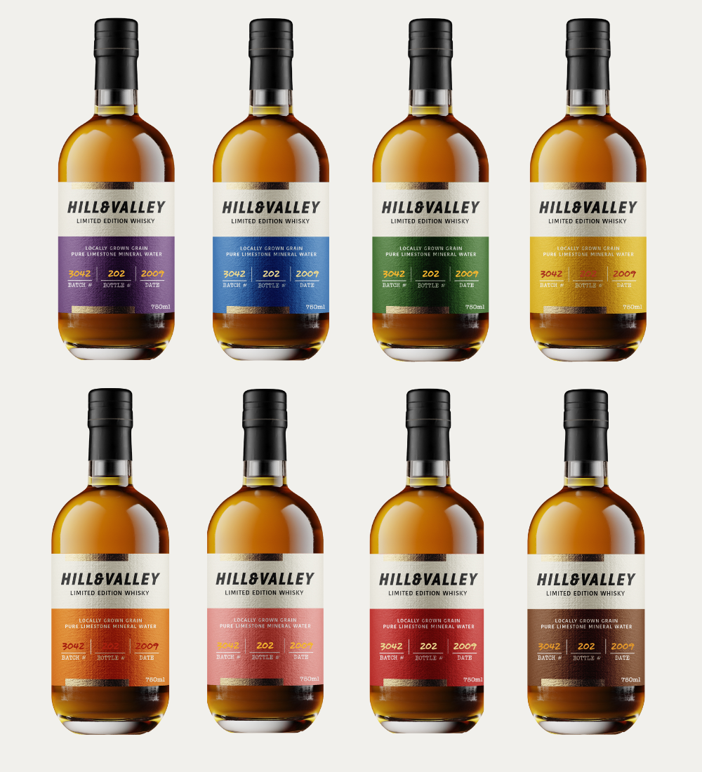
To explore just how much a whisky label’s hue can influence perception, we ran a blind survey in June 2024 with over 550 participants across Canada. Eight fictional labels, identical in every way except for colour, were created for a made-up whisky brand. On the bottles there is no mention of distillery, style, grains, cask type, age or ABV. All of the bottles were exactly the same with the only difference being the label colour.
Then came the ask: how do you expect this whisky to taste? Participants could choose up to three general flavour profile categories from a list of nine and also had the option to write their own tasting notes if the categories did not match their expectations.
The flavour categories respondents selected from were as follows:
Grainy (Hay, Straw, Dried Grass, Porridge, Vegetal, etc.)
Herbal (Grassy, Herbaceous, Botanic, Vegetal, Leafy, etc.)
Golden Fruit (Orchard Fruits, Tropical Fruits, Marmalade, Citrus, etc.)
Dark Fruit (Red Fruits, Berries, Dark Fruits, Raisins, Fruitcake, etc.)
Baked (Buttery, Vanilla, Nutty, Pastry, Cake, etc.)
Candied/Sweet (Confectionary, Honey, Maple Syrup, Caramel, Toffee, Milk Chocolate, etc.)
Roasted (Coffee, Dark Chocolate, Charred Wood, Leather, Tobacco, etc.)Spiced (Baking Spices, Licorice, Ginger, Black Pepper, etc.)Earthy (Mulch, Dirt, Musty, Barnyard, Wet Leaves, Old Books, etc.)
Who Took the Survey (And Why It Matters)
To decode the impact of colour on flavour perception, it wasn’t enough to gather opinions, we needed context. That’s why we captured four key pieces of demographic information from each of our ≈550 participants: age, gender, consumption frequency, and self-identified level of whisky knowledge.
Why these four? Because flavour perception isn’t just personal, it’s shaped by experience, exposure, and even how often you pour a dram.
A casual sipper might associate dark labels with sweetness or spice, while an industry vet might read it as a cue for something completely different. By balancing casual drinkers with seasoned enthusiasts, this survey gave us a rare snapshot of how colour cues might be silently steering flavour expectations, whether someone is a bartender, brand builder, or just browsing the whisky aisle.
That being said, the majority of respondents were aged 25–44, with a solid mix of intermediate (39.7 per cent) and advanced (26.5 per cent) whisky knowledge. Just under 70 per cent drink whisky at least monthly, meaning these aren’t out-of-touch assumptions, they’re regular drinkers responding in real time. Finally, the gender skewed slightly male (53.2 per cent).
The Results: How Color Drives Flavour Perception
Overall, six out of the eight label colours had a majority of respondents choose the same flavour category, proving that colour-flavour pairings aren’t just personal guesses, they’re collective instincts.
The exceptions? The pink label was close to a majority with 48 per cent of respondents selecting Candied and Golden Fruit categories but didn’t quite tip 51 per cent or more respondents to make it a majority. In addition, the blue label was the least conclusive of the bunch. While "Candied" still showed up as a frequent pick, responses were more fragmented, ranging from maritime to smoky to... well, “no idea.”
Based on the feedback, these are the top three flavour categories that were selected by respondents for each label:
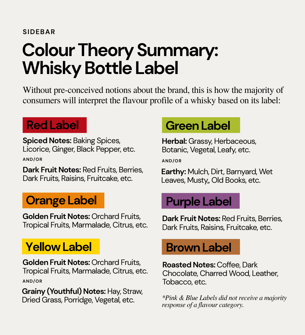
Red Label: Dark Fruit (65 per cent), Spiced (54 per cent), and Candied/Sweet (32.5 per cent)
Orange Label: Golden Fruit (57.4 per cent), Baked (38.8 per cent), and Candied/Sweet (37.9 per cent)
Yellow Label: Golden Fruit (67.5 per cent), Grainy (52.4 per cent), and Baked (37.0 per cent)
Green Label: Herbal (82.5 per cent), Earthy (48.0 per cent), and Grainy (41.2 per cent)
Blue Label: Candied (31.4 per cent), Baked (26.5 per cent), and Grainy (25.1 per cent)
Purple Label: Dark Fruit (70.9 per cent), Candied (30.7 per cent), and Roasted (28.5 per cent)
Pink Label: Candied (47.8 per cent), Golden Fruit (47.8 per cent), and Dark Fruit (35.0 per cent)
Brown Label: Roasted (51.4 per cent), Baked (38.3 per cent), Earthy (37.2 per cent)
Overall, these results suggest that colour cues aren’t just aesthetic, they’re functional. Consumers are using label colour to decode what the whisky might taste like before they even touch the bottle.
Colour Meets Collective Memory
When we drilled deeper into the data, the consistency became even more compelling. Six out of eight label colours showed strong alignment across all 14 demographic segments analyzed including age groups, gender, drinking frequency, and self-identified whisky knowledge.
In these cases, the majority of respondents, regardless of whether they were beginners or experts, daily drinkers or occasional sippers, selected the same top flavour association for a given colour.
Take the purple label for instance. Dark Fruit was the dominant association across every segment, from 25-year-old novices to seasoned experts aged 55+. The same was true for the green label, where Herbal flavour notes (herbaceous, vegetal, grassy) earned the top spot universally. Similarly, yellow and orange labels saw near-unanimous alignment with Golden Fruit, while brown skewed overwhelmingly toward Roasted. This pattern of cross-demographic agreement suggests a kind of visual-taste shorthand or a shared instinct for what certain colours should taste like in a whisky context.
These results reinforce a central insight: flavour perception, at least when triggered by visual cues, may not be as subjective as we like to believe. In the absence of branding, bottle shape, or style indicators, colour alone was enough to create stable sensory expectations. That kind of cross-demographic coherence is rare in consumer research, and it underscores the functional power of label colour as a design tool. This isn’t just about aesthetics, it’s about subconscious storytelling.
Where Do We Go From Here?
Imagine walking into a bottle shop where you could scan a shelf visually, guided not by arbitrary design trends, but by intuitive flavour codes. That’s where this is heading. By building toward a more flavour-first, colour-smart packaging culture, the whisky industry could:
Enhance accessibility for new drinkers
Encourage flavour exploration
Help consumers taste and relate different brands based on their flavour-profiles, not country or type
Future-proof brands for a visual-first generation of consumers
This idea isn’t about conformity—it’s about clarity. Just as wine hints at style through bottle shape and colour or chips use colour-coding on their packages to indicate different flavours, whisky could benefit from a visual system rooted in flavour expectation. That’s the ethos behind the Flavor Camp Tasting System: creating a shared language to help drinkers navigate complexity through intuitive sensory groupings.
Using a shared colour-flavour logic doesn’t erase brand identity. There's still endless room for creative execution through layout, typography, materials, finishes, bottle shape, and even hue. But by aligning at the flavour level, producers can speak to the palate before a word is read or drop has been tasted.
Colour doesn’t just sell whisky. It tells whisky. The label is the first taste and when done right, it helps the right drinker find the right bottle, faster. Flavour may be personal. But how we translate it visually? That might just be the common ground we’ve been missing.


